Shop Assistant
A mobile app to improve the shopping experience
Shop Assistant is a mobile app improving the shopping experience. Users can easily create a shopping list, and the app offers an optimized shopping plan.

Result
The Shop Assistant mobile application addressed the needs of users who plan and perform their shopping. Three common tasks in the shopping planning were identified. The application was designed to automatize and facilitate these tasks. Namely, creating a shopping list, comparing prices, and locating stores.
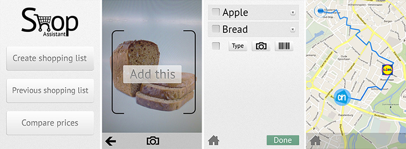
The users can create a shopping list (adding items by typing, but also taking a photo of them, or scanning their bar code). The final shopping list is analyzed, and price comparisons of multiple shops in the neighbourhood are provided. A function of splitting the list into two different shops is included, if going to two stores minimizes the price.
The final design was presented together with the detailed description of the screens, communicating not only the visual design, but also content, user flow, and interactions.
The final high fidelity, iterative prototype can be found at: Shoppie

Method
Rapid prototyping was used in combination with user tests to identify the main problems that the users encountered during the interaction.

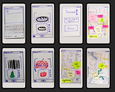
Designing of the Shop Assistant application started with initial user research (survey and individual interviews with people from the target group) to specify and prioritize the requirements. Based on the results, we created storyboards and a conceptual model of the app, and created quick low-fidelity paper prototype.
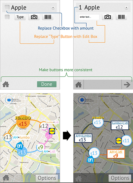
Testing the paper prototype revealed several design issues, that inspired us to improve the app in the second iteration of the design.
We tested the high-fidelity interactive prototype of the second version on a mobile phone with target users, and used the results of this test to create the third, final, version of the design.