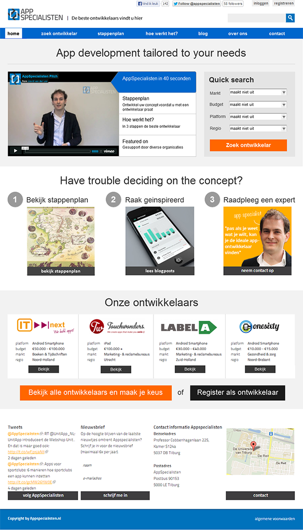
Appspecialisten.nl
Usability evaluation and re-design of Appspecialisten.nl
Appspecialisten is a website where clients can find application developers according to their requirements and needs. The quality of the developers' work is evaluated before being added to the database. Our goal was to identify the user's needs through task analysis, and help Appspecialisten improve their website.
We performed interviews to understand the business processes and requirements as well as the types of users. To evaluate usability we created personas and possible behavior scenarios on the website. The issues found were described and the possible improvements were provided, those improvements were implemented in the redesigns of crucial pages.
Result
The main page was redesigned as follows:


Method
The QOC method is used to make decisions and it consists of several major steps:
- Decompose problem into important interaction problems
- Formulate them as a question.
- Propose options.
- Set criteria.
- Pick the best option(s) according to the criteria.
Solution
The main question to answer was:
How can the interface enable visitors to put in an offer request?
This problem can be broken down into sub-problems. Solutions for these sub-problems contribute to the solving the general problem.
- How can the interface allow users to find appropriate developers?
- How can the interface allow users to develop their concept?
- How can the interface allow users to be aware of the knowledge they need to talk to developers?
- How can the interface help developers save time when talking to clients?
- How can the interface support users in finding relevant information in the knowledge base?
- How can we make the goal of the website more clear to users?
Summary of the main suggestions for improvements:
- Use the details about the platform, budget, and market that already were selected for the search into the contact form.
- Include the roadmap from Appar (App development steps) in the home page.
- Provide background information on Apps and App development under a clear name.
- Allow users to choose several search options and then press “search”.
- Put the 40 second pitch video to the homepage to make the goal of the website clear in no time.
- The website focuses on having high quality standards for the developers on there. This is not communicated explicitly on the website. Users might be more convinced to request an offer if they know that the quality of the developer will be high.